ADDENDUM
Editorial office
and TV studio
CLIENT: QVV, VIENNA
INVITED COMPETITION,
1. PRIZE
Former bank branch becomes Addendum Editorial Office
Addendum is an Austrian media project and research platform. Addendum's editorial team has grown steadily, so an expansion of office space was necessary. Former premises of a Volksbank branch in Vienna were chosen as the new location. The concrete building from the late 70s is flanked on both sides by historic buildings. The ground floor occupies the plot to a depth of approximately 40 meters, behind which a picturesque garden opens up. Through the elongated space, the garden is visible from the street. The juxtaposition of different zones has successfully created a varied and spacious office landscape.
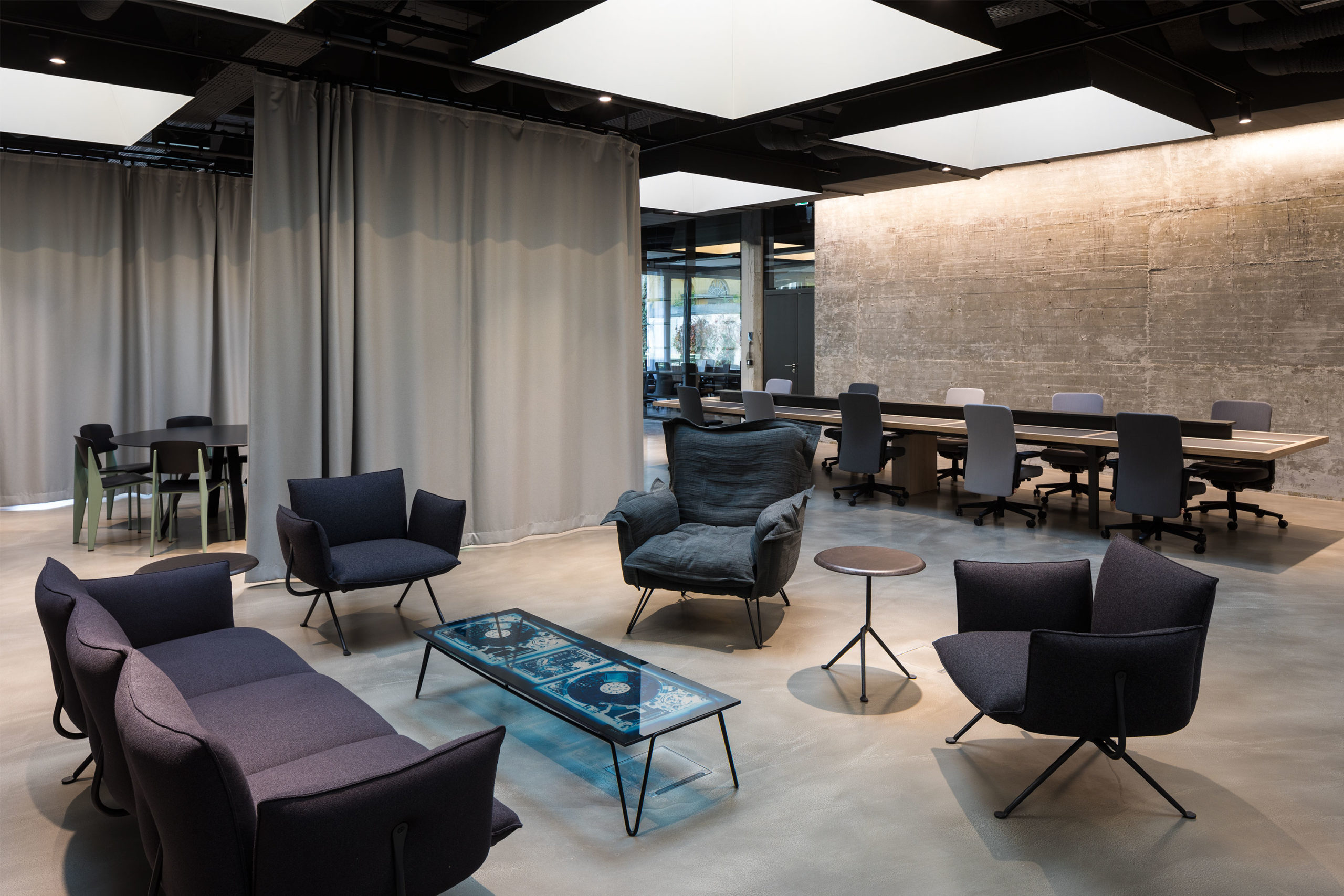
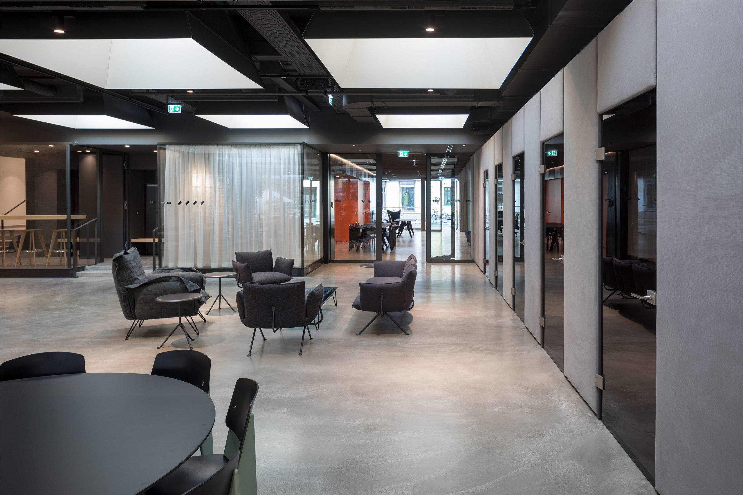
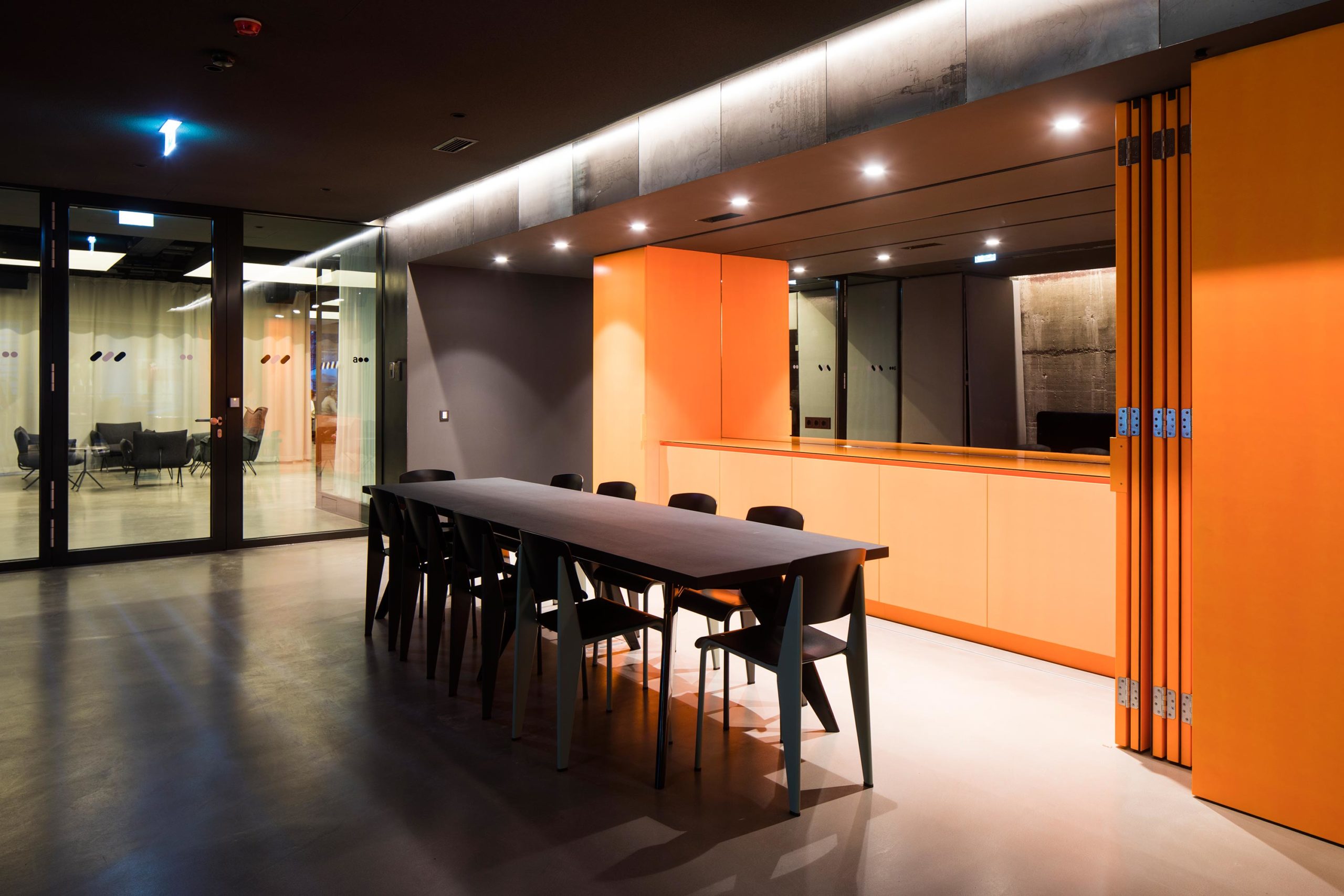
The entrance area serves as a reception, but can also be used for informal meetings and smaller events. The necessary infrastructure of a kitchenette is hidden behind a bright orange wall covering, opposite a large, blue velvet sofa. As a contemporary interpretation of the open-plan typology, there are numerous possibilities for retreat and communication, in addition to the adjoining large workroom, including telephone boxes, small meeting rooms and a tea kitchen with staff lounge. The long work tables are reminiscent of old library tables, the table tops in brushed, lightened oak are structured with the typical inlays of dark linoleum. There are no assigned desks, the employees can freely choose their workspace.
The challenge of transforming the initial space
The vault not only formed the backbone of the bank, but, with its meter-thick concrete walls, it is an unalterable element, which we successfully integrated in the open office plan. By carving out and exposing the formerly clad concrete, the massiveness became even more tangible. The manual processing of the concrete in the 1970s, with rough tamped concrete surfaces on the side walls up to the high-strength concrete of the vault, becomes visible through the exposure.
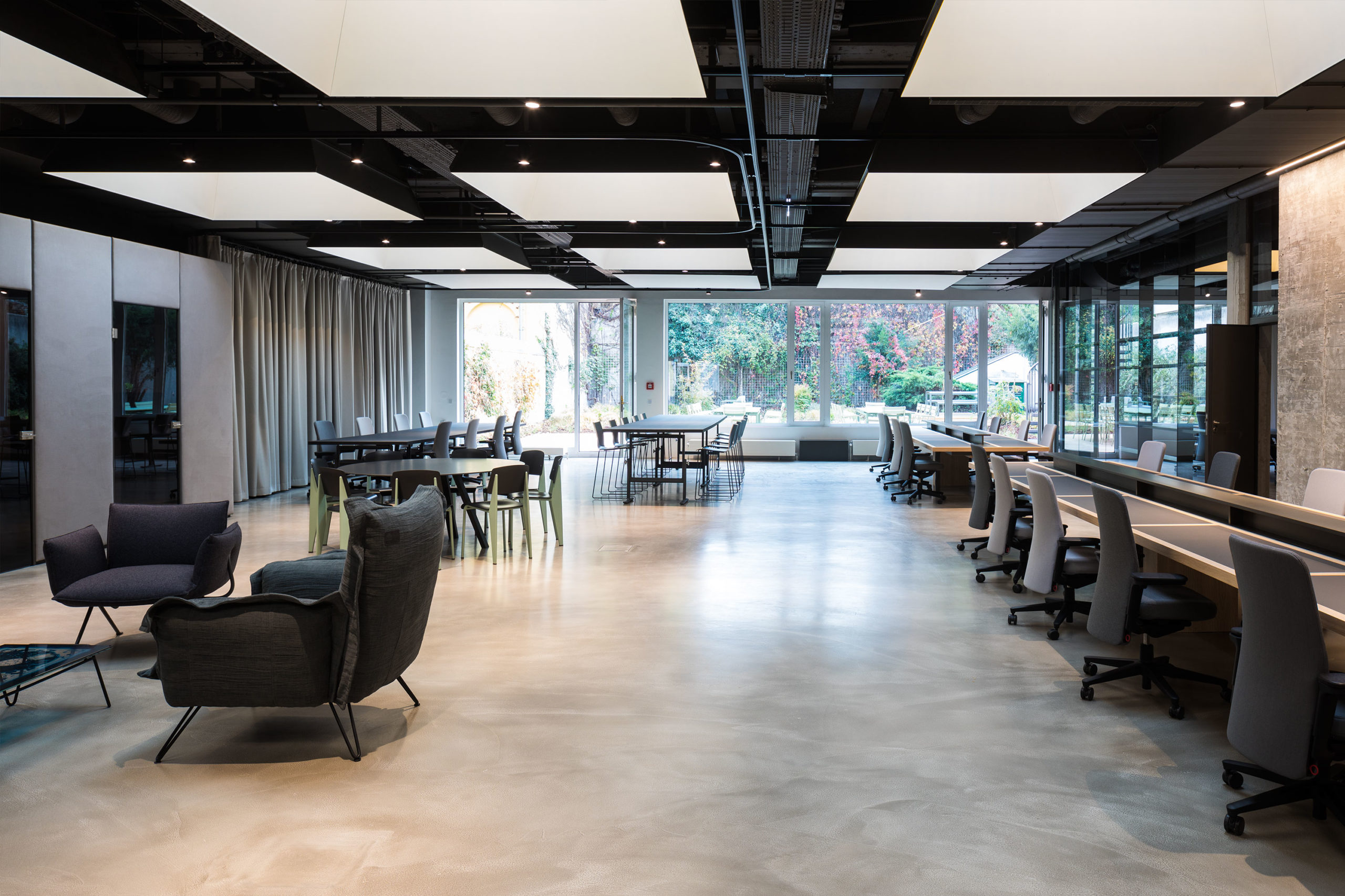
The complex daylight situation in the existing building presented a particular challenge in the design of the office rooms. Because of the windowless side walls, lighting was introduced from above, by the use of skylights. The lighting is staged via light pyramids. The bright inside of the pyramids visually enhances the daylight by reflecting it. This creates a virtual light horizon, above which all installations and constructions recede into shadow.
The large room can be structured with acoustically effective curtains via a rail system. In this way, one half of the room can be quickly transformed into a lecture room for 60 people or a round, intimate meeting room for a project team.
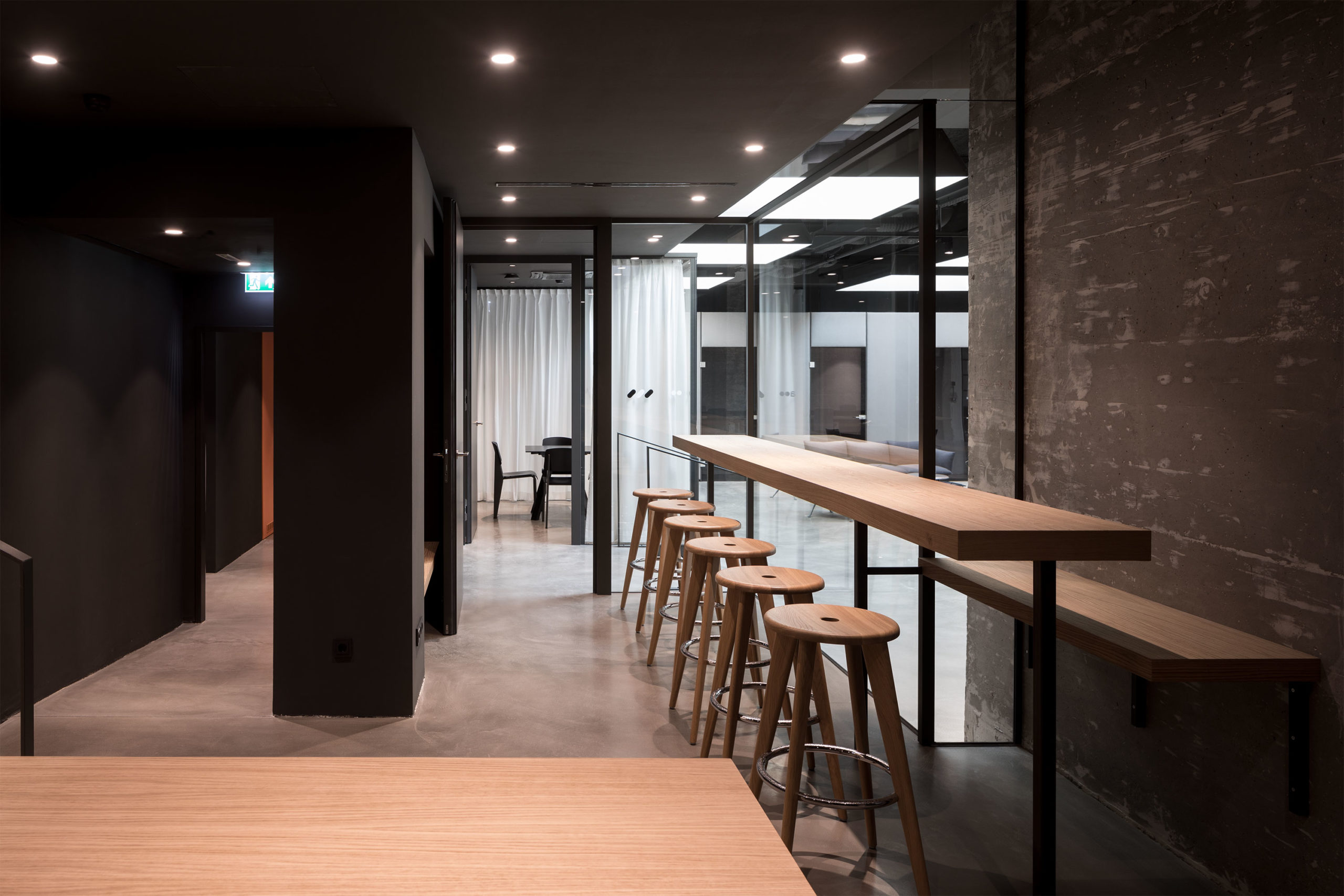
The material concept is based on exposing the solid components, in order to emphasize the haptic and sensuous quality of the raw material. The exposed concrete is complemented by filled concrete floors, dark raw steel and oiled, matte black wooden surfaces. A soft contrast is created by the curtains, the textile wall tapestries and the covers of the softly upholstered chairs in various grey fabrics, traditionally used for men’s suits. The bright orange of the folding walls in the intermediate area gives this space a special energy and radiance, otherwise disrupted by the lack of daylight.
Extending the office into the garden
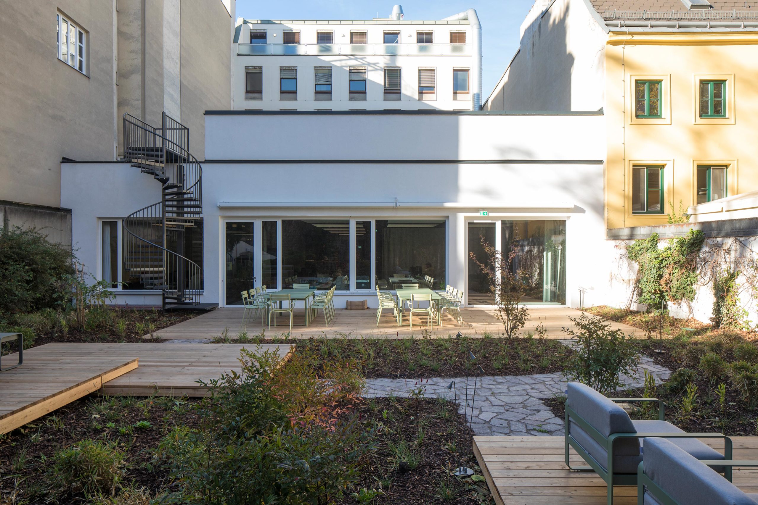
Large-scale glazing makes the transition from the workroom to the garden appear fluid. Depending on the time of year, employees benefit from the atmospheric view or can even use the courtyard garden as an open-air office. The lush flora makes the courtyard space a small universe that naturally merges with the surrounding courtyards to form a green scenery. The garden invites team and visitors alike to meet and linger on the various wooden terraces, which extend the interior to the outside, and provide the opportunity for everyone to eat or work together.
