THE CHAPEL
Designing a funeral chapel is not the everyday business of an architect. All the more curiosity and creative interest were triggered by the commission from a family in Styria to the Austrian-Finnish office BERGER+PARKKINEN. An inspiring, atypical and particularly exciting task, also because it was a “building freed from compromising functions,” as architect Alfred Berger found.
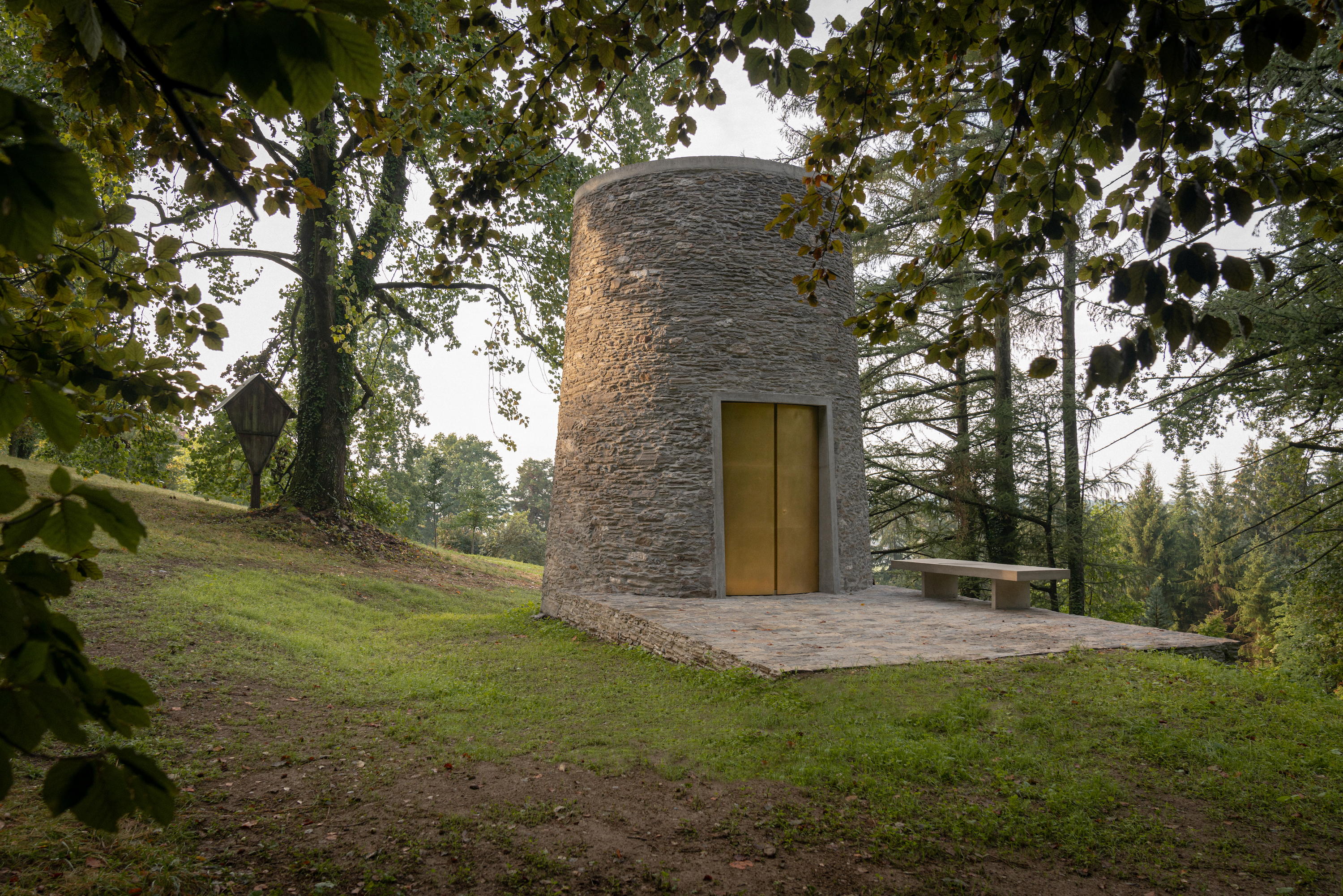
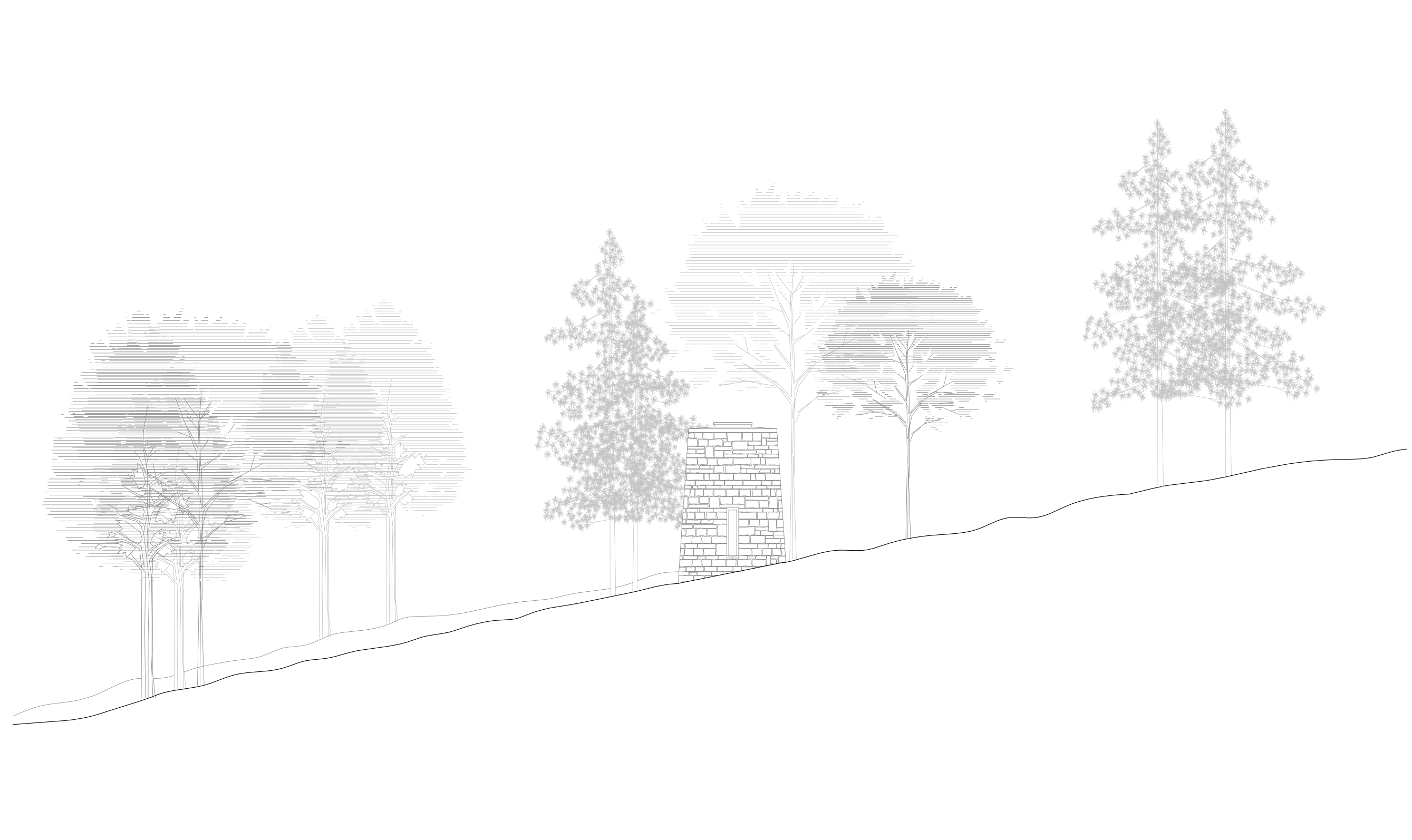
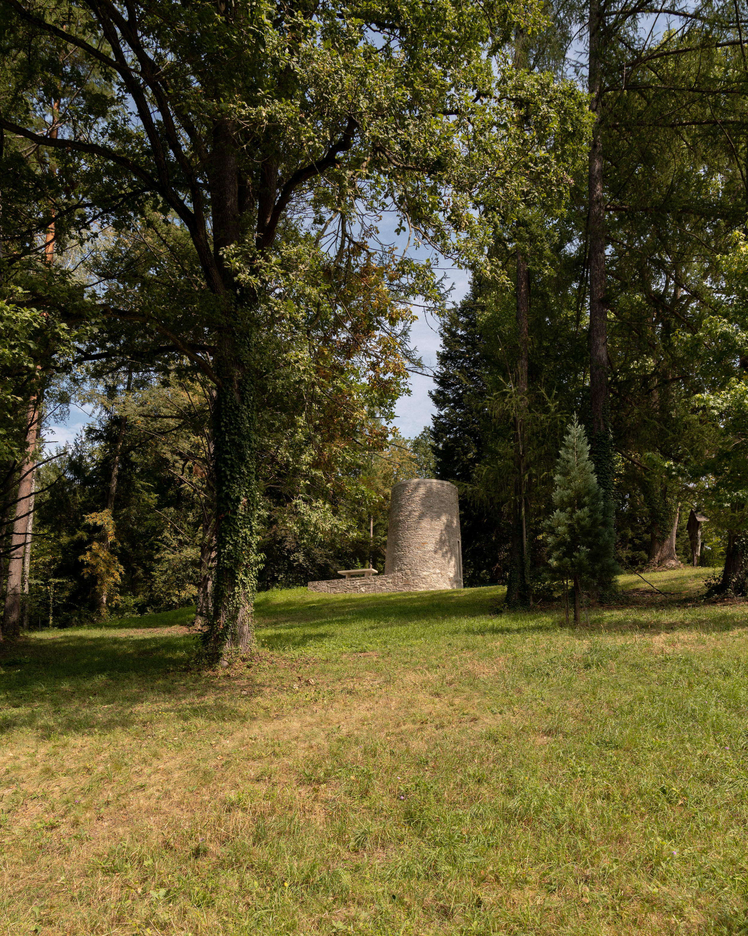
The result is a free-standing chapel in the castle park with an archaic, minimalist tower form that draws on the traditional burial culture of human history as a point of reference, as well as the special location in the midst of old trees. The architects created a connection to the castle within sight, using light and a vertical orientation to create the mysticism and spiritual atmosphere appropriate for a tomb.
THE MATERIAL
If we examine examples of architecture from early cultures, the oldest evidence of human history are tombs. While houses were built in wood, clay, straw and similar perishable materials, the desire for permanence was paramount in the construction of tombs. This is still true today for all sedentary cultures.
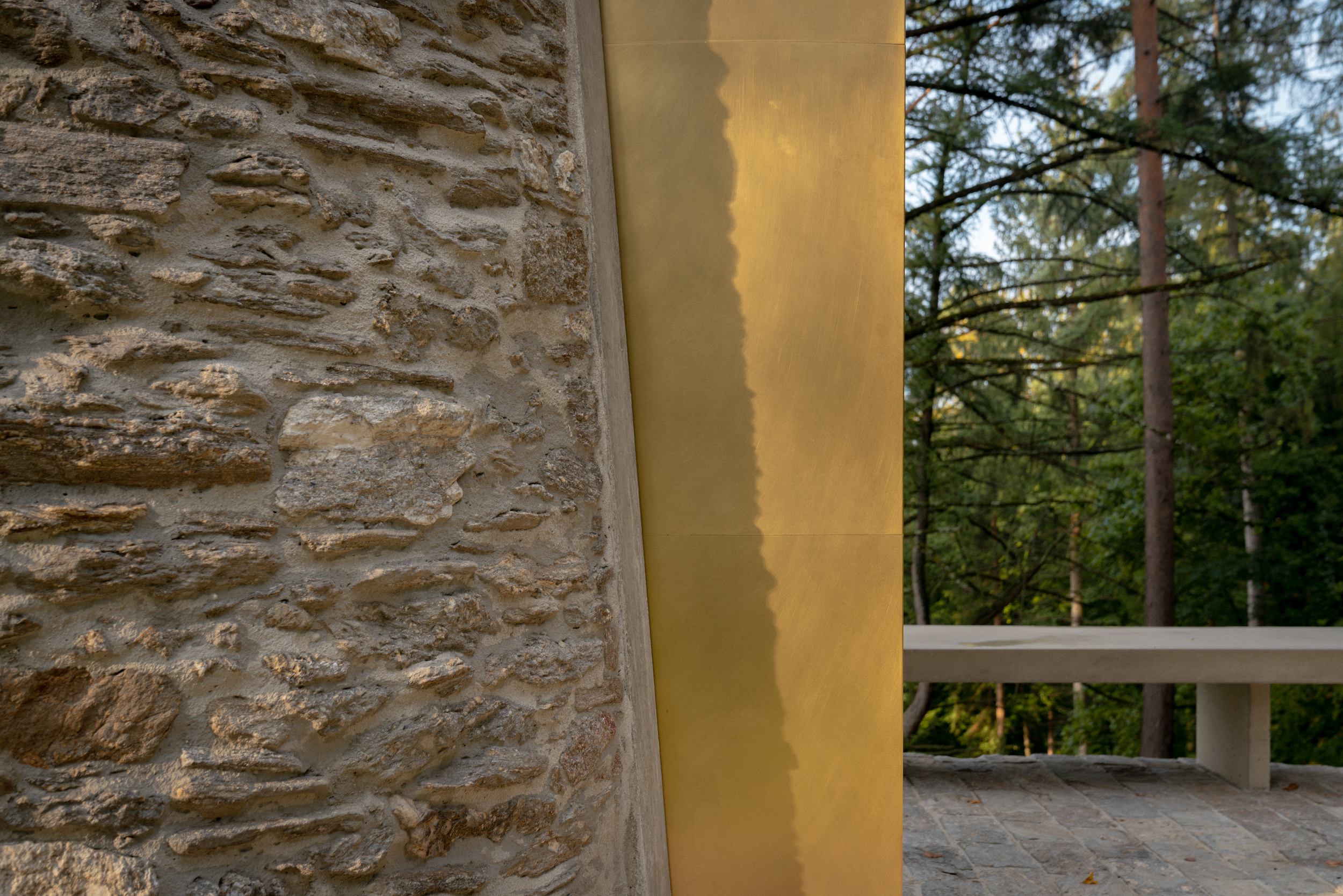
In the specific case, old masonry that would be suitable in principle for the construction of the chapel was available at the site. This local stone comes from a farm building mentioned in documents more than 800 years ago, which had collapsed a long time ago. The material coincides with that of the retaining walls and also with the masonry of the foundation walls of the castle.
The stone, with all its peculiarities, thus became decisive for the design and the architects succeeded in creating a material-aesthetic connection of the new building with the castle. The new walls were thus created from the remains of old walls, a fine example of sustainability and a cycle through direct reuse of existing demolition material.
THE SHAPE
Not all stone is the same and this local stone has its peculiarities. “Rough hewn and very rustic, it does not lend itself to fine geometric shapes; even edges are difficult to make. This material shows its effect best in the surface” says Alfred Berger. Thus, a decisive parameter for the design was defined.
The solution was found in the development of a very simple form without edges. The result was a round solitaire that calmly and powerfully takes up its position in the landscape. Timeless like the walls of the castle, but clearly contemporary in the precision of its design.
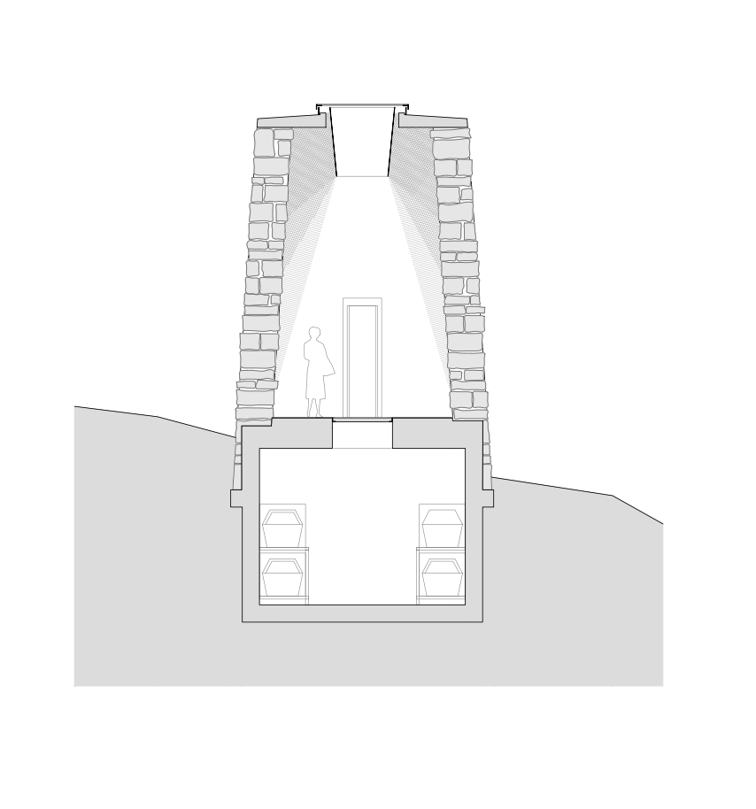
The tower, which tapers slightly towards the top, has only three openings. The gate and the narrow window, are recessed with prefabricated, sandblasted reinforced concrete frames in natural stone. The third opening is formed by a circular hole in the ceiling slab.
THE LIGHT
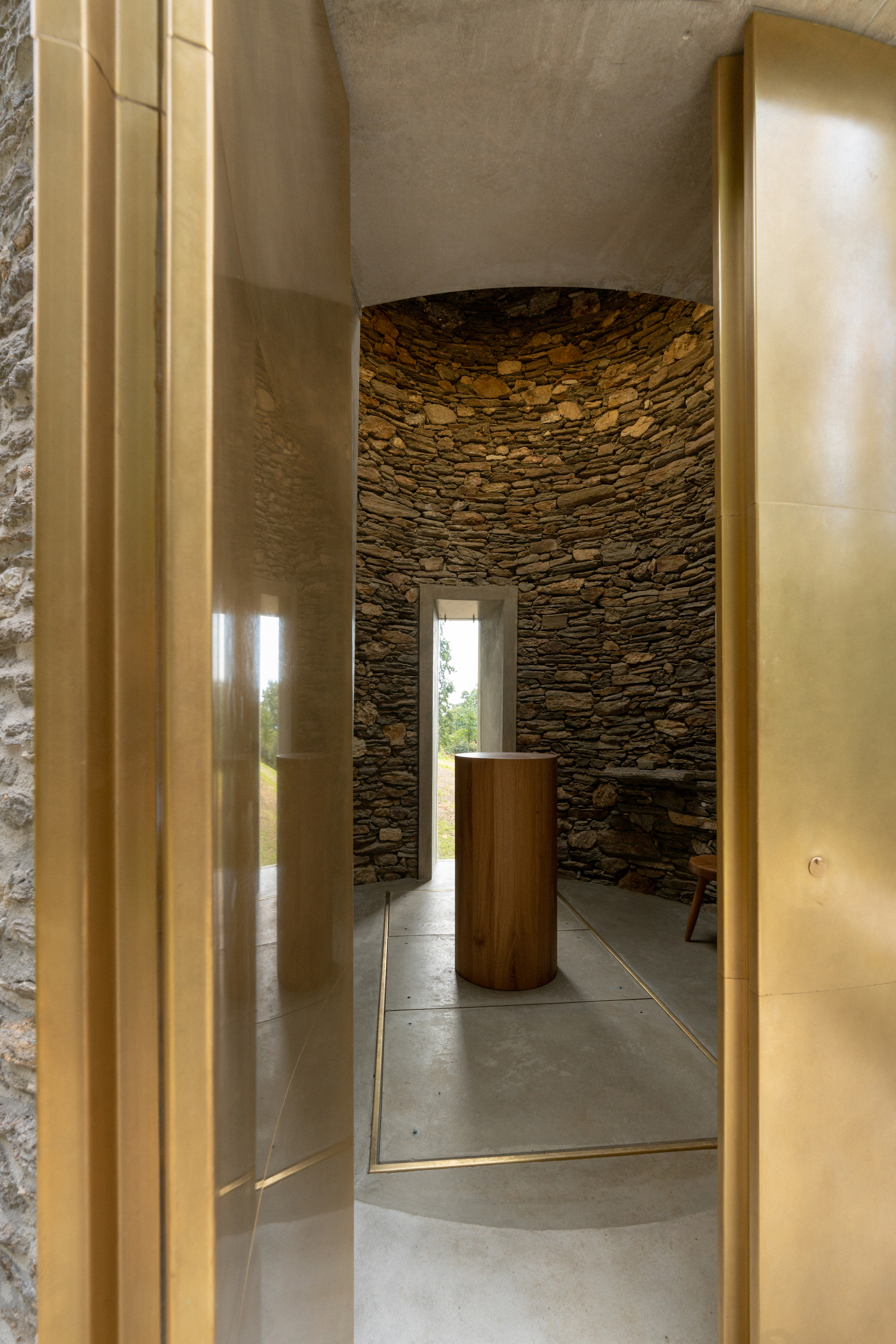
A double-leaf door leads into the chapel space on the averted side from a small vestibule. The narrow window opposite provides a view of the castle tower. Through this visual axis, the Chapel of the Dead is connected to the Castle of the Living.
The consecrated interior is brightly lit even when the door is closed, flooded with sunlight that enters through an opening in the ceiling. The round hole provides a view of the sky. The light coming from above emphasizes the height of the room, creating a vertical orientation.
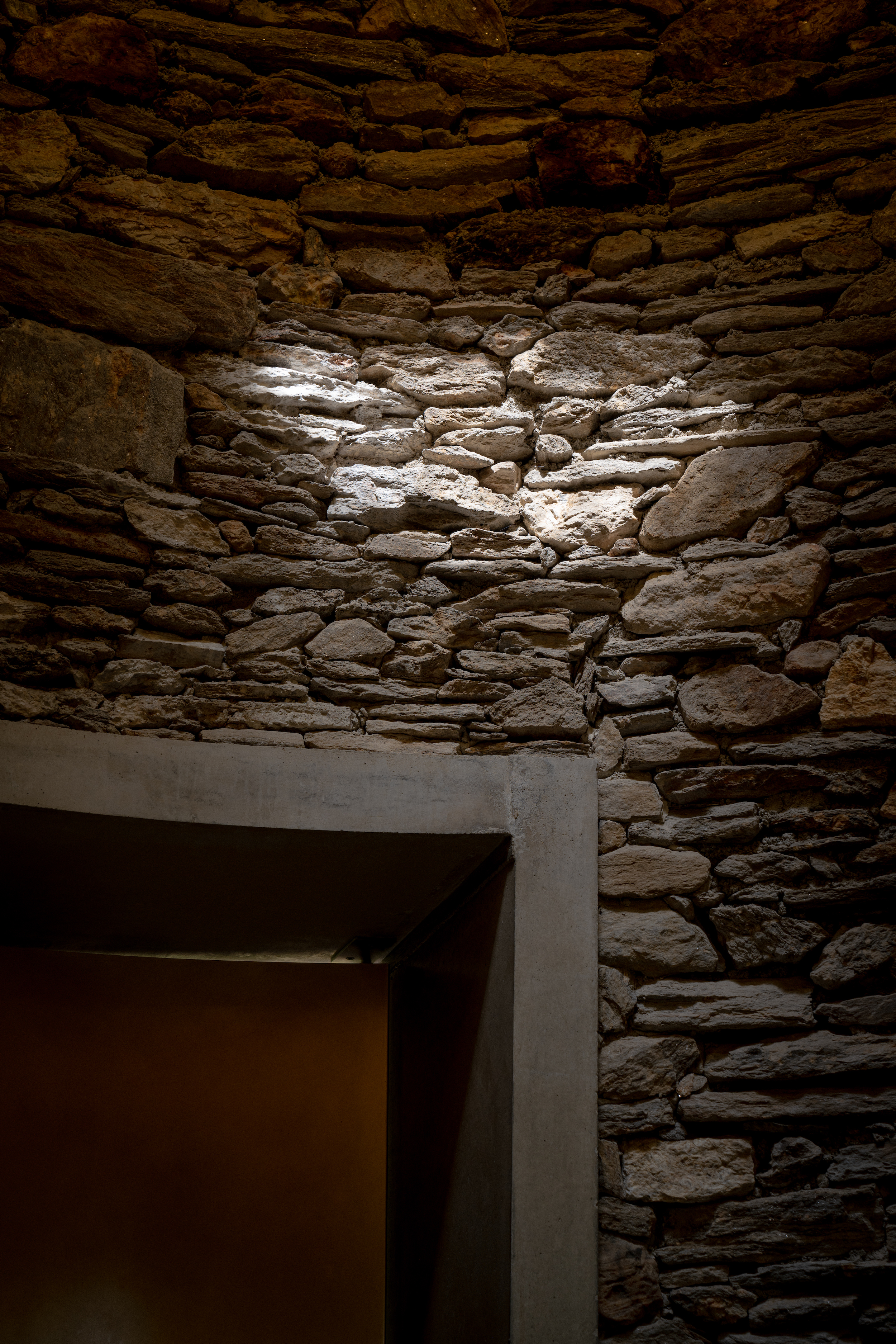
An inverted cone with a gilded interior surface, diffuses light evenly downward into the room. The intense light from above creates a warm glow on the rough stone walls. The plasticity and depth of the perfectly crafted, solid material, is highlighted by the light.
Edit
